
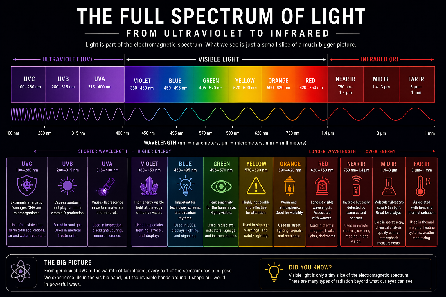
Most people think of light as brightness, maybe color, and maybe whether a bulb looks warm or cool. That is understandable, but it is also a little incomplete. Light is part of the electromagnetic spectrum, and what human beings can actually see is only a narrow band in the middle of a much larger range of wavelengths. NASA describes the electromagnetic spectrum as a broad range of energy that travels in waves, with visible light making up only a small portion of it.
That matters because different wavelengths do different things. Some are energetic enough to trigger chemical reactions, some are good at making certain materials fluoresce, some are excellent for visibility and signaling, and some are mostly experienced not as sight at all, but as heat, sensing, imaging, or invisible communication. Shorter wavelengths carry more energy than longer ones, and that simple relationship is a major reason as to why one region of the spectrum behaves differently from another.
So this is a walk across the spectrum from one side to the other: from ultraviolet, through the visible colors, and onward and upward into infrared. The color boundaries in the visible band are not perfectly sharp, and different sources round them a bit differently, but the overall map is solid enough to be very useful. Visible light begins at roughly 400 to 700 nanometers, with some fuzziness at the edges depending on the observer. But we will start our journey at the bottom…
UVC — 100 to 280 nm
UVC sits at the shortest-wavelength, highest-energy end of the ultraviolet band discussed here, and it is one of the easiest places to prove that “light” is not automatically a casual thing. The FDA notes that UVC from the sun does not normally reach Earth’s surface because it is blocked by the atmosphere, especially the ozone layer, so human exposure usually comes from artificial sources rather than daylight. That already tells you something important about it: this is not the kind of radiation people normally wander around in outdoors.
What UVC does especially well is damage biological material at a microscopic level, which is exactly why it shows up in germicidal and sanitizing applications. The same property that makes it useful for disrupting microorganisms is also what makes it dangerous to exposed skin and eyes. The FDA specifically warns that UVC exposure can cause severe burns and eye injuries such as photokeratitis. So yes, when UVC is used in germicidal systems, the question of blocking it is not optional; it is central to the design. That usually means enclosed fixtures, shielding, interlocks, occupancy controls, controlled exposure paths, and equipment that is designed so the UVC stays where it is useful and out of places where people are.
One of the more interesting things about UVC is that despite being extremely effective in certain controlled applications, it is not something you generally “see” in the ordinary sense. You mostly know it is there because of what it does, not because it contributes to normal human visual experience. We usually get it from specialized artificial sources such as low-pressure mercury lamps or dedicated UVC emitters, and real systems are built around containment, not around casual exposure.
UVB — 280 to 315 nm
UVB is the next step up in wavelength and down in energy, but it is still serious business. It occupies a middle zone in ultraviolet: less energetic than UVC, but still energetic enough to have strong biological effects. The FDA identifies UVB as part of the solar ultraviolet mix, though not all of it reaches the ground because the atmosphere filters a significant portion.
When people talk about ultraviolet and skin response, UVB is often doing a lot of the unpleasant work. It is strongly associated with sunburn and with the kinds of biological interactions that make ultraviolet exposure something worth respecting rather than romanticizing. That makes UVB relevant in discussions of sunlight, medicine, and controlled phototherapy, but much less relevant in normal lighting conversations. It is not something most people are trying to add to their kitchen, workshop, or porch.
The interesting thing about UVB is that it sits in a kind of uneasy middle ground. It is not as extreme as UVC, but it is still active enough that it matters in medicine, skin science, and radiation safety. We usually encounter it from the sun, and more deliberately from controlled medical or specialty equipment rather than ordinary illumination sources.
UVA — 315 to 400 nm
UVA is where ultraviolet starts to feel almost social. It sits nearest to visible violet and is the UV band most likely to show up in everyday discussions, mostly because it is behind a lot of the weird and fun stuff people associate with blacklights. The FDA notes that UVA is part of the ultraviolet radiation that reaches Earth’s surface, which already makes it more familiar to us than UVC.
What UVA does especially well is excite fluorescence in certain materials. That is why white shirts, laundry detergents, posters, minerals, inks, and security markings can suddenly become much more dramatic under a blacklight. The light itself is largely outside normal visibility, but the materials it hits can absorb that energy and re-emit some of it as visible light. That is one of the best examples in the entire spectrum of light doing something indirectly impressive. The light is not just illuminating an object; it is causing the object to behave differently.
This is also where UV starts overlapping with industrial usefulness in a way people often underestimate. UVA shows up in inspection, counterfeit detection, fluorescent effects, and some curing processes. It also plays a well-earned role in mineral science, where fluorescent minerals can absorb UVA and re-emit it as visible light, sometimes in dramatically different colours than they show under normal illumination. That makes UVA useful not just for spectacle, but for identification and study as well. It is common enough to be familiar, but still different enough from visible light to feel a bit exotic. We usually get it from sunlight, blacklight lamps, specialty LEDs, or other UV-capable sources designed for effect, inspection, or process work.
Violet — about 380 to 450 nm
Violet marks the short-wavelength edge of visible light, right near the transition from what humans cannot see to what we can. Violet is roughly in the 380 to 450 nm region, which makes it the first clearly visible stop on our tour.
That edge-of-visibility status makes violet especially interesting. It is visible, but it still feels close to ultraviolet in spirit: energetic, sharp, and slightly strange compared with the warmer end of the spectrum. Violet matters in discussions of optics, color science, and specialty lighting, but it is much less common as the dominant output in everyday general lighting than blue, green, or warm-white blends. One reason is simply human preference; another is that lighting systems are often designed around broad-spectrum white light rather than single-color output.
A fun thing worth mentioning here is that violet and purple are not the same thing. Violet can be a spectral color, meaning a color associated with a specific range of wavelengths. Purple is usually a perceptual mix created when the visual system combines red and blue responses. That makes violet physically cleaner than purple, which is a sentence that sounds fake until you spend enough time around color science. We usually get violet from specialty emitters, filtered sources, or as part of a broader spectral blend.
Blue — about 450 to 495 nm
Blue is where the spectrum starts feeling very modern. If you have spent time around LEDs, displays, screens, or discussions about circadian rhythms, you have already been spending time around blue light whether you meant to or not. It carries less energy than violet but still sits at the short, high-energy side of visible light. Blue is in the region following violet and preceding green within the visible spectrum.
Blue matters because it is both optically useful and technologically convenient. One of the biggest reasons modern white LEDs became so successful is that many of them rely on a blue emitter combined with phosphors that convert part of that blue output into other wavelengths, together creating light that appears white. In other words, a lot of the pleasant white light people think of as neutral or daylight-ish starts life with a very blue heart. That is a nice reminder that “white” is often an engineered blend, not a single thing.
Blue light is also strongly tied to scattering, atmosphere, visibility, screens, signals, and discussions of human biological response. It is one of the most important bands in modern lighting science because it is so often present even when it is not the star of the show. We usually get it from daylight, LEDs, displays, and filtered or direct-emission sources designed for signaling, effects, or instrumentation.
Green — about 495 to 570 nm
Green sits near the middle of the visible spectrum and feels almost like a balancing point. It is neither as aggressive-seeming as the short-wave end nor as warm and atmospheric as the long-wave end. It is just there, in the middle, doing a quietly impressive amount of work. Green is roughly between blue and yellow in the middle visible range.
One reason green matters so much is that human vision is especially sensitive around the middle of the visible spectrum. That helps make green highly effective in displays, indicators, instrumentation, and any situation where visibility efficiency matters. It is also a useful reminder that not all colors are perceived equally. A watt of radiant power is not the same thing as a watt’s worth of visual usefulness, because the eye is not equally responsive to every wavelength.
Green also has a nice double life. In one context it is a practical visibility color for instruments, signs, and indicators. In another, it is the color most people mentally associate with life, foliage, and the living world. We usually get green from direct-emission LEDs, phosphor blends, filtered light, displays, and of course from reflected daylight off chlorophyll-rich surfaces that have decided to make green their public relations department.
Yellow — about 570 to 590 nm
Yellow is where the spectrum starts becoming visibly warm without yet feeling fully orange or red. It occupies a relatively narrow slice, but works very well in attention, contrast, and visual identity. Yellow is between green and orange in the visible spectrum.
What yellow does especially well is announce itself. It is conspicuous, high-notice, and historically tied to warning, caution, and outdoor visibility. That makes it a naturally useful color for signals, markings, attention-grabbing design, and some traditional forms of outdoor lighting. It also sits close to the part of the spectrum where a lot of people start to describe light not just as colored, but as warm in emotional tone.
A fun historical side note is that yellowish light played a huge role in how people came to think outdoor lighting should look, especially in older sodium-based streetlighting eras. We usually get yellow from filtered or mixed visible sources, phosphor systems, signaling devices, and broad-spectrum light sources that happen to lean warm in distribution.
Orange — about 590 to 620 nm
Orange is transitional in the best way. It sits between the conspicuousness of yellow and the full warmth of red, and because of that it tends to feel atmospheric, practical, and a little nostalgic all at once. Orange is between yellow and red in the visible range.
If you have ever looked at older streetlighting or industrial area lighting and thought it had a sort of hazy amber character, orange is part of that story. Longer visible wavelengths often feel softer and less harsh than shorter ones, even though the full perceptual story is always more complicated than a single color label. Orange also works well where visibility, warmth, and mood need to coexist without slipping fully into red.
One nice thing about orange is that it helps show how much lighting aesthetics are tied to spectral composition. The history of outdoor lighting is not just a history of fixtures and poles; it is also a history of which wavelengths we found practical, affordable, and acceptable to live under. We usually get orange from mixed-spectrum sources, filtered emitters, signal systems, and warm-toned lamps whose spectrum leans toward the long-wave side.
Red — about 620 to 750 nm
Red is the long-wavelength edge of visible light, and is viewd as the longest-wavelength light discernible to the human eye, around 620 to 750 nm. That makes red the last clearly visible stop before we pass over into infrared.
What red does is interesting because it is both emotionally dramatic and physically modest compared with the short-wave end. It carries less energy than blue or violet light, but it remains enormously useful. Red is everywhere in signaling, warning systems, brake lights, status indicators, darkroom applications, and low-light environments where preserving night adaptation matters. It is also heavily tied to heat in popular imagination, which is not entirely wrong, since it sits right next to the infrared region.
One fun thing about red is that it often reads as urgent, warm, or even biological, despite the fact that from a wavelength standpoint it is simply the far visible edge before invisibility returns. We usually get red from LEDs, incandescent-like warm sources, filters, displays, signal lamps, and spectral blends whose output leans long.
Near Infrared — about 750 nm to 1.4 µm
Near infrared is where the spectrum leaves human vision but stays very much in the world of useful light. NASA notes that infrared extends beyond the red end of visible light and that some parts of the infrared region are strongly associated with sensing and practical observation. Near infrared is especially useful because it is close enough to visible light to behave in very usable ways for imaging, signaling, and detection, while still remaining invisible to the eye.
This is the region that helps people realize how much “light” they use without ever seeing it. Remote controls are a classic example. So are many sensor systems, cameras, and imaging tools that can detect reflected near-infrared even though humans cannot. In environmental science and imaging, near-infrared is also valuable because vegetation reflects it differently than many other materials, which helps scientists analyze plant health and land cover. NASA highlights infrared’s usefulness in observing things that visible light alone does not reveal.
Near infrared is a beautiful reminder that visibility is not the same thing as usefulness. We usually get it from sunlight, IR LEDs, remote-control emitters, sensors, lasers, and imaging systems designed to exploit what the eye misses.
Mid Infrared — about 1.4 to 3 µm
Mid infrared is where the spectrum starts leaning harder into heat, molecular behavior, and analysis. By this point light is less like illumination and more like interaction. It is still electromagnetic radiation, still part of the same broad family, but now the applications often belong to chemistry, sensing, industrial measurement, and material characterization rather than human seeing. NASA’s broad treatment of infrared as a region strongly associated with heat and with seeing beyond visible limitations is useful here.
What makes mid infrared especially interesting is that many molecules interact with it in ways that are analytically useful. That is why infrared spectroscopy exists at all: different molecular bonds absorb different infrared wavelengths, which lets scientists learn something about what a substance is made of. In practice, that means mid infrared can help confirm whether a drug is what it claims to be, reveal contamination in a sample, or help scientists track gases in the atmosphere that no human eye could ever spot on its own. NASA uses infrared data this way to measure things like temperature, water vapour, and trace gases, while pharmaceutical analysis uses infrared-based methods to help verify identity, quality, purity, and potency. This is the part of the spectrum where light stops being just a means of visibility and starts becoming a way of interrogating matter.
We usually get mid infrared from thermal sources, specialized emitters, heated objects, analytical instruments, and sensing systems built to detect or emit outside the visible band. It is a very nerdy part of the spectrum, which is exactly why it deserves more love.
Far Infrared — about 3 µm to 1 mm
Far infrared is the region most people have already “experienced” without necessarily realizing it. NASA notes that infrared is often associated with heat, and far infrared is where that association becomes especially intuitive. At this point we are talking less about what the eye sees and more about what the body feels or what an instrument can detect.
This is the territory of thermal radiation, radiant heating, atmospheric energy exchange, and thermal imaging systems that detect temperature differences by reading emitted infrared rather than reflected visible light. It is also a nice place to end because far infrared makes the philosophical point of the article better than almost any other region: light does not need to be visible to be real, useful, or important. A warm object radiating energy is participating in the same larger electromagnetic story as a violet LED or a blue sky. It is just doing so at a wavelength your eyes were never designed to report.
We usually get far infrared from warm bodies, hot surfaces, heating systems, the Earth itself, and instruments designed to read thermal emissions rather than visible appearance.
A useful clarification: color temperature is not wavelength
This is worth saying plainly because people mix it up all the time. A lamp described as 3000K or 5000K is not emitting a single wavelength any more than a symphony is playing a single note. Color temperature is a description of overall visual appearance relative to a thermal reference, not a claim that the light exists at one precise nanometer value. The visible spectrum itself is continuous, and most white-light sources are blends, not single-color emitters.
That means a “daylight” lamp is not the same thing as blue light, and a “warm” lamp is not just orange and red. Once you start thinking spectrally, a lot of everyday lighting language gets more interesting.
Closing thought
Most of us spend our lives interacting with one thin slice of the electromagnetic spectrum and casually calling it “light.” But the bigger truth is that light does much more than help us see. It disinfects, excites fluorescence, carries invisible signals, reveals materials, supports imaging, drives sensing, and turns into heat before it ever becomes something the eye can notice. Visible light is important, obviously. It is the part we live in. But it is only one chapter. NASA’s overview of the electromagnetic spectrum makes exactly that point: the visible rainbow is just one band among many forms of electromagnetic radiation.
And frankly, that is part of what makes lighting so interesting. The bulb over your doorway is useful. The spectrum behind it is a whole different rabbit hole.